Friday, April 10, 2009
Unbranding?
In Mavericks at Work Jim Buckmaster, CEO of Craigslist, revels in what he calls the "unbranding" of the site. At first glance, CraigsList.org doesn't have the trappings of a hot brand. No logo, no real web design, no color scheme. But a brand is much more than a logo and pretty design elements.
I completely disagree with Buckmaster's assessment that CL doesn't have a brand. Their brand is huge, and the "unbrandedness" of it is a big part of what makes it so.
 In it's more basic essence, a brand is the story your customers hear and the way they feel every time they interact in any way with your company. It includes the obvious visual elements - colors, logos, typography, packaging - as well as some not-so-obvious elements. For instance, the tone and choice of words in a headline is branding. The personality of your wait staff is branding, as well as is everything on your menu. Your product is your brand, and so is the customer service section of your website.
CraigsList has a brand because everyone knows and buys in to what the site is about. Seth Godin would say that they have a tribe.
Even if you haven't gone through a formal branding process for your company, you have a brand. There's a general understanding that your customers and vendors have about you. If you just leave it at that, you won't really capitalize on it's power. Here are 4 steps to making your brand a powerful tool.
- Define your brand. Sit down with customers, vendors and employees and ask "What are we all about". Dig deep to find the common, underlying themes. Do a SWOT (Strength, Opportunities, Weaknesses, Threats) analysis. The key here is complete honesty. There's no room here for Dilbert-esque mission statements.
- Define your audience. Go beyond simple demographics (i.e. males 30 - 50) and seek to truly understand who you want to talk to and who wants to listen.
- Take all the data from the above exercises and find 3-5 (ish) bullet point statements that can become the core of your brand message.
- Include the above brand message points in every interaction with customers, vendors and employees. Every sign, sales letter and website should focus on those points. Write an elevator speech including them. Take one and make it a focal point for advertising.
Keep this tool sharp by focusing on it as a regular part of your business practices.
Wednesday, April 8, 2009
8 graphic design tips for non-designers
Many small & medium-sized businesses create their marketing materials in house without the benefit of being able to use a trained graphic designer. With so many tools available these days, it been easy for any business person to start creating business cards, websites and simple brochures on their own.With that in mind, here are 8 principals to making your projects visually stand out in the crowd.
- Try a distinctive illustration style instead of standard stock photos. How many smiling customer service portraits have you seen this week? You probably can't remember, because you ignored them. One way to get instant attention is to go away from the kind of stock photography you see everywhere. iStockPhoto.com has an HUGE selection of inexpensive royalty-free illustration you can use to spice up your visuals.

- Use a metaphoric image instead of realistic one. Take that smiling customer service shot I mentioned previously. You want to tell your viewers about how well you'll take care of them. Finding a metaphor will increase how the idea resonates in their minds. Remember Staple's "Easy Button"? Play word association with co-workers or friends to come up with ideas.


- Use lots of white space. The temptation is to fill every inch of available space with something. Unfortunately, many times that actually decreases the effectiveness of your content. "White space" is used to help direct the eye to the important parts of your message, helping viewers parse the information and retain it.
- Stick to one message, and say it loud. This is related to the last. Break down your marketing into simple core messages, then follow the "one-per" rule. One thought per brochure page, per flyer, per slide. Directing the focus of your audience to one point will maximize recall.
- Play with scale. Changing the size of objects and text on the page increases the visual excitement and helps direct the eye. It's also a great way to separate yourself from the pack visually. Showing something way bigger that it really is catches attention. So does something very small surrounded by lots of big things.
- Contrast. The more contrast in your piece, the more it will be noticed. Contrast size and scale, when everything is the same size it's hard to differentiate what's important. Use contrasting colors to draw the eye to different areas of the layout.
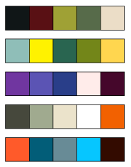
- Work an interesting color scheme. Color is one of the most powerful tools in your toolbox. Humans have huge psychological reactions to colors, so use that to your advantage. It's really easy to get into a simple, primary color palette that blends in with everything else out there. Take a visit to Adobe's Kuler.com website and explore some of the incredible color schemes there. A unique mix of colors will grab attention immediately!

- Stick to two fonts and a few styles. Mixing typefaces is an art, one that requires time and experience. When you are designing something, choose an interesting or bold font for the headline and subheads and another for the body text, and stick to just those. Avoid overuse of bolds, italics and different colors within the main body of the copy. All of this makes it easier to read and comprehend your text.


