Three for the price of two
Here's a technique I use frequently on 2-color print projects to simulate a broader color scheme. This works in both Quark and InDesign CS (but not earlier versions InDesign). It uses the "Multi-Ink" feature of the swatches palette.
Both apps have the Multi-Ink ("Mixed Ink" for InDesign) feature, which allows you to mix various percentages of spot colors. When faced with a 2-color job, I pick two complementary colors from the Pantone book and add them to the swatches palette. For this to work, you are going to need two colors on the deeper side of the spectrum.
Next, I go to the swatches palette and select the Multi-Ink feature. In Quark go to EDIT>COLORS>NEW and select MULTI-INK from the pull-down menu. For InDesign, go to the swatches palette and click on the triangle to access the fly-out menu. Choose NEW MIXED-INK SWATCH. Both apps will open a control panel that contains all the colors in the swatch palette with a blank area for a percentage next to each. Set each of your PMS colors to 100%. If you chose colors far enough apart on the color wheel and with a deep enough tint, you'll get pretty close to black.
I use this as a third color for my text. Now your two-color project looks like two-color plus black. The "black" text has a lot more contrast and boldness than any of the PMS colors. So far, I haven't had any printing or registration issues if I keep the size of the type 10 points or more.
You can also use this feature to create new colors by mixing lower percentages of the PMS colors. I'm working on a project that is using a dark burgundy and black. A 20% mix of PMS 202 with a 15% of black makes a decent tan to use as a highlight color.
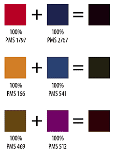
Here's some samples to look at:
Both apps have the Multi-Ink ("Mixed Ink" for InDesign) feature, which allows you to mix various percentages of spot colors. When faced with a 2-color job, I pick two complementary colors from the Pantone book and add them to the swatches palette. For this to work, you are going to need two colors on the deeper side of the spectrum.
Next, I go to the swatches palette and select the Multi-Ink feature. In Quark go to EDIT>COLORS>NEW and select MULTI-INK from the pull-down menu. For InDesign, go to the swatches palette and click on the triangle to access the fly-out menu. Choose NEW MIXED-INK SWATCH. Both apps will open a control panel that contains all the colors in the swatch palette with a blank area for a percentage next to each. Set each of your PMS colors to 100%. If you chose colors far enough apart on the color wheel and with a deep enough tint, you'll get pretty close to black.
I use this as a third color for my text. Now your two-color project looks like two-color plus black. The "black" text has a lot more contrast and boldness than any of the PMS colors. So far, I haven't had any printing or registration issues if I keep the size of the type 10 points or more.
You can also use this feature to create new colors by mixing lower percentages of the PMS colors. I'm working on a project that is using a dark burgundy and black. A 20% mix of PMS 202 with a 15% of black makes a decent tan to use as a highlight color.
Here's some samples to look at:
1 Comments:
That's a great tip!
I'm helping my cousin out with a 2 colour DL brochure at the moment, it' a great idea and I'll be sure to pass it on.
Cheers
bkpr
Post a Comment
<< Home