Wednesday, April 27

update-apple rocks!

I've bought a decent amount of music from iTunes Music Store in the past few years. That was one of the more painful parts of the whole "deleting my entire iTunes library" thing.

I was resigned to losing all that music (and money), but chanced an e-mail to iTunes tech support anyway. Within 24 hours, they responded saying that I could re-download all those tracks. No problem. It was quick, friendly and easy.

I wonder if Microsoft would be so nice?

Monday, April 25

Dual digital tragedies

I returned from teaching my InDesign class Friday afternoon to find that the DSL was down. Whoops, Walkman forgot to mail Verizon a payment. The bill was paid over the phone, but I was told that it would be 24-48 HOURS before the service would be restored. 24-48 hours! I started to sweat. By dinner time my hands were shaking. DSL withdrawal is an ugly thing. Sometime around 9pm I was curled on the floor in a fetal position.

I survived (barely) until later Saturday afternoon. I've been setting up a new user account in OSx on my laptop and was in the midst of transferring files over, when something horrible went wrong. Somehow, I DELETED MY ENTIRE iTUNES LIBRARY!!!!

Yes, let me repeat that: I DELETED MY ENTIRE iTUNES LIBRARY!!!!

I have no clue how I did this, but apparently I grabbed the folder and trashed it (probably by key command) without knowing. Adding to the horror, I emptied the trash without checking to see what was in there (something I'm usually in the habit of doing as a fail-safe measure). Since I have no data recovery apps, my beloved 5.4 days worth of Mp3 tracks are gone.

After going into a fetal position for the second time this weekend, I thought "Well, go back and re-rip what you can from your CD collection". A nice idea! I could do that while I finish up the weekend house work I had. EXCEPT- I have no internet connection. That means that iTunes can't automatically connect to CDDB to get track info.

AAAAAAAUUUUUUGGGGGGGGGGGGGGGGGG!


The DSL is working again. Thank goodness. I have e-mail again. My RSS reader filled up with new items. My hands are still a little shaky, but I suspect that it will pass. Life is good again. Well, except for the loss of my beloved music.

Friday, April 22

Wolfgang & Me

I keep reading about how classical music effects brain activity, so I decided to run an informal experiment. I usually listen to jazz when I'm working, but I'm going to start listening to only classical to see if I can perceive any differences in my thinking over time.

I just bought Yo-Yo Ma's Bach: The Cello Suites. A great album for deep thinking. Ma's unaccompanied solo cello is beautiful and haunting. I don't know if I've heard anything quite like it before. I find myself getting lost in it, carried away somewhere imaginative.

I was also recently listening to the soundtrack from Amadeus. One of my favorite scenes is the Emperor's reaction on opening night of the first work he commissioned of Mozart.
MOZART
So then you like it? You really like it, Your Majesty?

JOSEPH
Of course I do. It's very good. Of course now and then - just now and then - it gets a touch elaborate.

MOZART
What do you mean, Sire?

JOSEPH
Well, I mean occasionally it seems to have, how shall one say? (he stops in difficulty; to Orsini-Rosenberg) How shall one say, Director?

ORSINI-ROSENBERG
Too many notes, Your Majesty?

JOSEPH
Exactly. Very well put. Too many notes.

MOZART
I don't understand. There are just as many notes, Majesty, as are required. Neither more nor less.

JOSEPH
My dear fellow, there are in fact only so many notes the ear can hear in the course of an evening. I think I'm right in saying that, aren't I, Court Composer

I've used this exchange in a my design classes as an example on composition. Mozart's reply indicates that each note was selected with a purpose, each to fit in perfectly between the preceding and following notes. If you take away any of these notes, as Emperor Joseph suggests, there would be an incompleteness to the score.

I read once that a design (or painting, song, sculpture, story, etc) is finished when nothing more can be added to enhance the idea and everything that doesn't add or support the idea has been removed. Just like Mozart's notes.

Something I always think about with that scene. Salieri seemed to be the only character that truly recognized Wolfgang's genius, which I'm sure if not far from reality. I wonder about the singers and musicians that performed his work. Did they realize that they were taking part in something that changed the course of music? When the viola player went home after that performance, did he have any clue that he just performed an opera that was revolutionary for the time, or was it just another day at the office?

Tuesday, April 19

pondering flames

We recently built a sizable bonfire to clean up yard debris and deadwood. I love watching a fire. On a camp out, I'm the usually the last one up watching the embers burn out.

What is it about a fire that get's one thinking? Why do flames pull us into deep thought?


click here for full image

Fire equals both good and bad. Hell's never-ending flames. A house fire. Witches burned at the stake. All represent fire's dark side, the part that scares us. You can also rekindle an old flame. Or spark you imagination. Passions can be ignited.


click here for full image

You can't posses it either. You can have it's fuel, but the flame itself will not be captured.


click here for full image

There is something so primal about fire that it seems we can't resist it's hypnosis. It's both calmly meditative and panic-inducing. Nothing else seems to bring out such primal emotions on both sides of the spectrum.

Monday, April 18

Not a huge job, but fun...

You know the new Solstice from Pontiac? The one that's on The Apprentice?

As luck would have it, I got the gig of designing the first round of official apparel to go with the launch:

Solstice Shadow Tee

There are a few other Tees in the works. Like I said, not a huge job, but it's fun. I also might get the full catalog design gig as well (crossing fingers).

I don't watch the show, but if anyone sees The Donald in my shirt, let me know.

Tuesday, April 12

Don't eat it

The ealier post about cereal and food styling has genereated some interesting traffic. One disclaimer: I'm never said I was a food stylist. I was the assisant at the photo studio. Don't want anyone getting the wrong idea. These are tricks I observed while working on various shots.

A couple more fun thoughts on food photography-

Never eat anything that's been used as a prop. If it looks moist and juicy, that's because it's had glycerin brushed on it. Turkeys are cooked just enough to be solid, then the skin is brushed with a mixture of Kitchen Bouqet and oil, which gives it a fake tan. Usually a heat gun or very high temp oven is used to add the final touches on the appearance of the skin.

You know this pizza shot:


Ever wonder how they get the cheese to create those gooey strips on the side of the slice that's being lifted up? Once the slice is held in place, strips of Mozzarella are placed on the side where they want. Grab your handy heat gun and melt those babies until they look delicious.

Sunday, April 10

Interview- Mark Simonson

I had the pleasure of interviewing the highly-regarded typographer Mark Simonson last Friday via iChat.

Enjoy.

KW: What is your basic background as a designer? How did you get started?

MS: I started out mainly as an art director, but I also did some illustration occasionally.


KW: Where did you get your design education?

MS: I'm mostly self-taught. I went to a two-year program at a college, but dropped out before I finished to take a job at an advertising art studio. I still need to take bowling and archery to finish my Associate Degree.


KW: LOL. Did you have any design influences growing up, how did you decide that this was the biz for you?

MS: One of my uncles was a graphic designer. I have vivid memories of the work he used to bring home from college when he was studying it. It looked like something I would like. I also had another uncle who did painting, cartooning and sign lettering. Both of them influenced me a lot when I was young.


KW: Small world. Both my parents are designers. I remember poring through the Letraset catalog when I was a kid and playing with press-type.

KW: What was the first font you designed and do you still like it?

MS: I designed my first font when I was in college, but it was just a school assignment and has never been published. It did get me started on wanting to do type design, though. That was in about 1976. The first font of mine that was published was Felt Tip Roman in 1992.


KW: What is your design process? How does a font go from your imagination into OpenType?

MS: I'm always thinking about type ideas on some level. When I doodle, I doodle type mostly. I save everything that I put on paper and have files of type ideas going back thirty years. Sometimes, I get and idea and immediately start working on it and end up with a digital font a few months later. This was the case with Goldenbook and Mostra. Other designs are things that have been in the back of my mind for a long time and keep bubbling up to the surface, and eventually they become fonts. Coquette and Proxima Sans were like that.


KW: How much time do you spent on paper versus on the computer?

MS: I use paper mostly as a memory aid, to get the idea down before I forget it. I used to do fairly tight drawings, but I've found that it's easier and faster to tighten things up in the computer instead.

Also, sometimes I use paper to get the gesture down. One thing I can't do easily is draw something completely from scratch on-screen. It just comes out all ill-proportioned and stiff looking. So I do scan in my rough paper sketches, even though they are fairly loose. I find it's the best way to get the proportions and feeling right.

I know in my mind how the characters should look, and that's why it's better for me to work on the screen once I've got the basic idea down on paper. Less work--i.e., using Undo vs. an eraser.


KW: Follow-up question to your early influences - is there a designer who's type work has influenced you the most?

MS: That's hard to narrow down. Early on I was influenced by the ITC people--Herb Lubalin, Tony Stan, Ed Benguiat, etc. Then I saw Jim Parkinson's work for Rolling Stone. Then there was Goudy and Zapf. I guess my biggest hero is Morris Fuller Benton. His stuff continues to amaze me. I'm also a big fan of Bernhardt and Erbar. Matthew Carter is also amazing.


KW: Do you have a favorite letter to draw (or one that you find troublesome)?

MS: For some reason I find J and U boring to design. I like to do E, G, and S in the caps and a, e and g, in the lowercase.


KW: I find "s" to be the most troublesome. The lowercase "g" is one of my favorite letters to look at.

MS: S is one of the most difficult, I agree, but maybe that's why I like to draw it. It's something I've figured out how to do fairly well (I think).


KW: What was the most challenging design that you've created?

MS: Probably one that I'm working on right now, the new version of Proxima Sans. I'm expanding it to seven weights (up from three) and three different widths. It also has a much bigger character set, almost 700 characters. Add the italics, that makes 42 fonts.


KW: Ah. I just read about that on your site. How far along are you?

MS: The roman is basically done. I'm working on the italics now, doing all the fussy optical stuff to make it look correct. If you just slant it, the curves and angled strokes get distorted. So I'm going through and making it all optically correct.


KW: That's the kind of detail that separates designers like you from many others.

MS: I hope so.


KW: What environment do you feel the most creative in?

MS: When I'm supposed to be doing something else.

A lot of my font ideas arose as doodles during boring meetings I was forced to attend when I was working as an employee at various firms. It's actually harder for me to find time like that now that I am on my own.


KW: LOL. I've done that (but not nearly as well as you) Do you listen to music while you work

MS: Sometimes. I don't have a consistent audio background when I work. Sometimes I listen to music, but I find news radio works at least as well. Sometimes I don't have anything on. I can't listen to really loud music when I work. I used to share an office with an illustrator who liked to listen to speed metal at top volume while he worked. That didn't work too well.

Changing around what I listen to seems to work best for me.


KW: Are there any "young-up-and-coming" type designers that you think are doing something outstanding?

MS: Christian Schwartz is very good. He makes me wish I had got more into it when I was younger, like him. He's not exactly "up-and-coming", he's already up there. Eric Olson is another one. He lives in my area so I see him now and then. Josh Darden's work looks very promising. I heard he recently left Hoefler Frere-Jones, so I assume we'll be seeing more from him.


KW: So is OpenType the way to go, now? Both from a font user and font designer perspective?

MS: I sure hope so. I think it's better all around for several reasons. It's cross-platform, so you don't need separate fonts for Mac and Windows. It can have much bigger character sets than PostScript Type 1 fonts. It can also have all sorts of fancy features built-in, so you don't have to have separate fonts for alternate characters, small caps, etc. Unfortunately, applications and operating systems are not quite up to speed yet, but I believe this will change (Quark is the big heel-dragger on this--next version they're promising, though). It's just a matter of time.


KW: I stopped using Quark almost a year ago. Go InDesign!

MS: From a type designer's point of view, I like the fact that I can work in PostScript bezier curves. I find TrueType curves very hard to work with. Same with hinting. TrueType hinting can produce amazing results, but it's extremely tedious to do well. PostScript hinting works well for most purposes, unless you want to optimize a font primarily for screen use, like Verdana, Georgia or Arial.


KW: One last question, what are the best resources for someone to learn the art of type design?

MS: Leslie Cabarga's books (Logo, Font, & Lettering Bible and Learn FontLab Fast) are good introductions. Bringhurst's The Elements of Typographic Style is a good reference for anything to do with type. Letters of Credit, by Walter Tracy, is a classic book about designing type. Type specimen books are pretty important. You can never have too many of those. (At least I can't.)


Friday, April 8

Fun with flakes

Cameron and I were talking about the problem of smashed cereal and it reminded me of one of my former duties as the assistant in the previously mentioned commercial photo studio.

One of our big clients was Kelloggs, for which we produced many, many cereal bowl shots.

As the lowest on the totem pole, it was my job to go through a CASE of cereal and pick out (with tweezers) only the absolute PERFECT flakes to be used by the food stylist. I'm not kidding, an entire case of cereal for about 50-60 perfect flakes.

The more "natural" shapes brands (like Special K) were easier, of course, but the real buggers were the specialty shaped cereals. Anyone ever try to find a perfect Crispix flake?

So the secret is out. Here's the Food Stylist's recipe for a perfect bowl of cereal:

1. Dump several boxes of cereal out onto flat baking sheets.
2. Using tweezers so one doesn't damage any pieces, root through finding the most perfectly shaped flakes (about 50-60)
3. Fill the prop bowl about 2/3 with Crisco, creating a dome at the top
4. Again using tweezers, embed the perfect flakes into the Crisco to create a pleasing arrangement and realistic volume of cereal
5. Fill in gaps and edges with Wild Root Hair Tonic to simulate milk.

Wild Root is a 50's era product that men used to slick back their hair. Elmer's Glue forms a skin under the lights and doesn't last long. When I was shooting, there was a only one place to get Wild Root, a chain drugstore. I'd get some odd looks when I'd go in and by several bottles at a time. We'd use Wild Root for the spoon shot, too. Use a dab of Crisco to hold the flakes in place and drip Wild Root on the spoon for the milk.

And Barbasol shaving cream holds up better than whipped cream for a photoshoot. Unless the whipped cream product is what is being advertised, that is. Then you have to use the real thing. I've drooled of many cherry and apple pies that looked gorgeous but had the faint odor of Menthol.

Wednesday, April 6

Three for the price of two

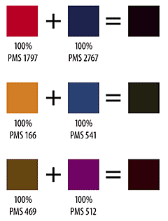
Here's a technique I use frequently on 2-color print projects to simulate a broader color scheme. This works in both Quark and InDesign CS (but not earlier versions InDesign). It uses the "Multi-Ink" feature of the swatches palette.

Both apps have the Multi-Ink ("Mixed Ink" for InDesign) feature, which allows you to mix various percentages of spot colors. When faced with a 2-color job, I pick two complementary colors from the Pantone book and add them to the swatches palette. For this to work, you are going to need two colors on the deeper side of the spectrum.

Next, I go to the swatches palette and select the Multi-Ink feature. In Quark go to EDIT>COLORS>NEW and select MULTI-INK from the pull-down menu. For InDesign, go to the swatches palette and click on the triangle to access the fly-out menu. Choose NEW MIXED-INK SWATCH. Both apps will open a control panel that contains all the colors in the swatch palette with a blank area for a percentage next to each. Set each of your PMS colors to 100%. If you chose colors far enough apart on the color wheel and with a deep enough tint, you'll get pretty close to black.

I use this as a third color for my text. Now your two-color project looks like two-color plus black. The "black" text has a lot more contrast and boldness than any of the PMS colors. So far, I haven't had any printing or registration issues if I keep the size of the type 10 points or more.

You can also use this feature to create new colors by mixing lower percentages of the PMS colors. I'm working on a project that is using a dark burgundy and black. A 20% mix of PMS 202 with a 15% of black makes a decent tan to use as a highlight color.

Here's some samples to look at:

Tuesday, April 5

BUY! BUY! BUY!

Right Brain, Left Field is now being traded on BlogShares. Since this is a new blog there, the share price is cheap!

Monday, April 4

Kodak Moment

I was going through some old images on my back-up drive and came across this image from 1994 or 1995. I was in the very beginnings of my career, working as an assistant for one of the more prominent commercial shooters in the area, Jim Powell. We went on a family vacation to visit my grandparents in South Carolina, and Jim let me borrow the studio's back-up Nikon F3 with an assortment of lenses, as well as giving me a handful of Kodak Ektachrome 100 to shoot.

This was one of the better images that came from that trip. It was about 11pm and the trees were being lit from the lights on the dock.


Click here for the full image

One of the things that I learned from Jim was how to nurture talent. Anyone that worked there was allowed free access to any of the studio's resources after hours to shoot personal projects (non-commercial, that is). Jim believed that in order to be a better assistant, one had to be a good shooter. And in order to be a good photographer, one must shoot a lot of images. And it worked. I spent countless hours at night and on weekends polishing my studio and darkroom skills. As I grew as a shooter, my ability to know what the other photographer's needs would be increased and I became a much better assistant.

Now I use that training in my job as a designer and creative director. I can communicate and collaborate with photographers in a much more effective way. I have a better understanding of what a photographer needs.

Thanks, Jim.

Friday, April 1

Pumpkins

Being the son of two designers and from a long line family artists, my parents tried to teach and nurture any artistic and creative abilities they could at a very early age. At one point we were in a pumpkin patch, discussing color when I was five. According to my mom, we spent some time talking about how the shadows on that particular day were more of a purple color.

Shortly thereafter in my Kindergarten class, we were given an assignment to color in Halloween picture. I guess I remembered the lesson on shadows and colored my pumpkin the standard orange, but then added purple shadows (I'm thinking it probably looked more like purple zebra stripes than shadows). Apparently the teacher didn't like my purple shadows and gave me the KIndergarten equivalent of an "F".

I wish I could remember the scene that followed, as I'm sure the was fun to watch my designer parents berate my teacher for not only squashing my creative exploration, but for not realizing that shadows could, in fact, be purple.

I related that story a few years ago during a lunch seminar with Judy Rich, the Worldwide Creative Director for Ketchum Advertising. Judy responded by telling of a study that had been done recently comparing the creative ability of children to adults. Unfortunately, one of lowest scoring demographics on the creativity scale for adults were elementary school teachers.

Judy gave me a box of Crayolas in remembrance.